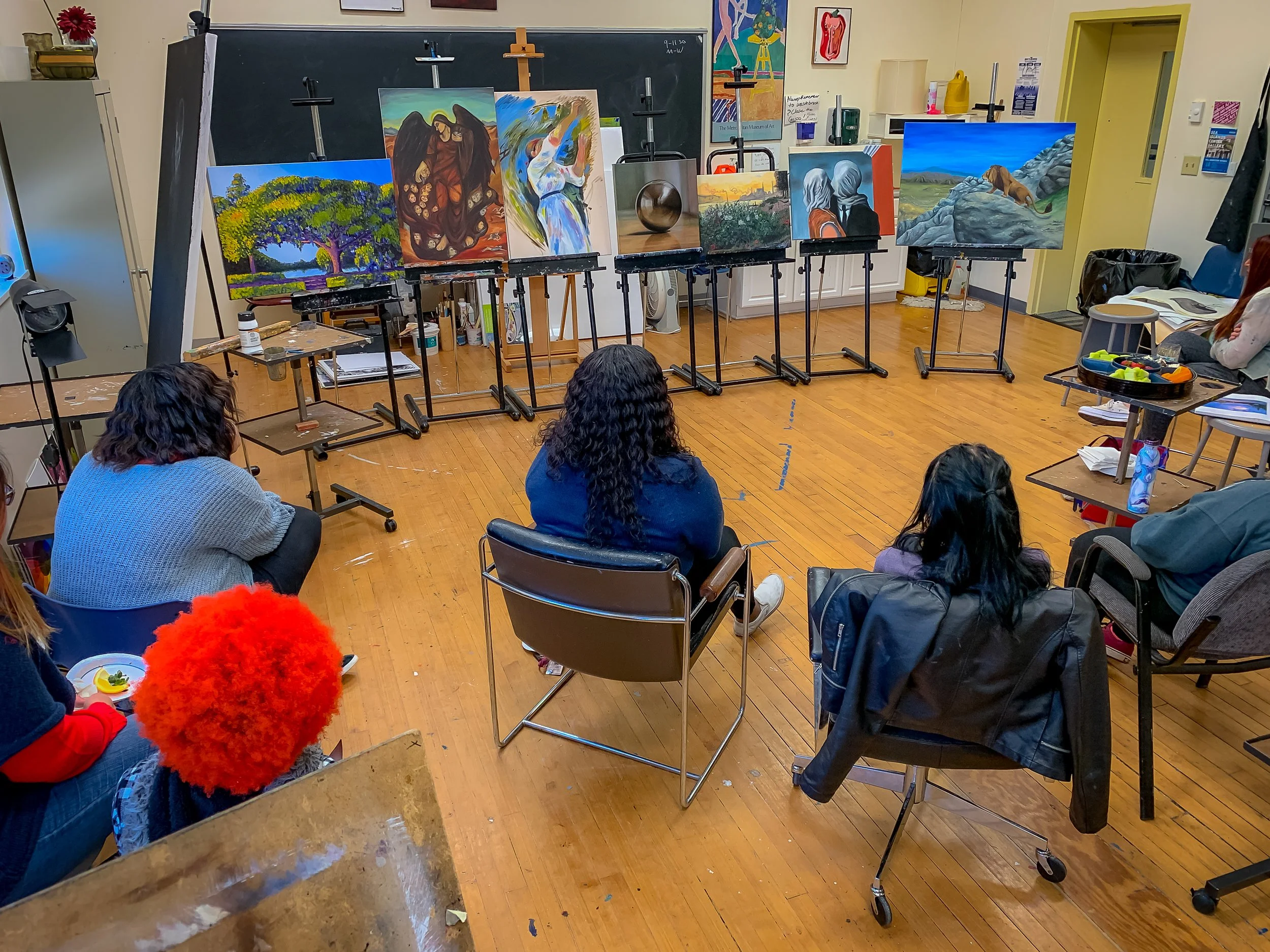
Paintings can become focal points through balanced composition, color, and strategic placement, drawing immediate attention with bold contrasts and inviting closer engagement with detailed elements. Properly positioned and lit at eye level, paintings command presence without overwhelming their surroundings, serving as centers that enhance the mood and theme of any space.
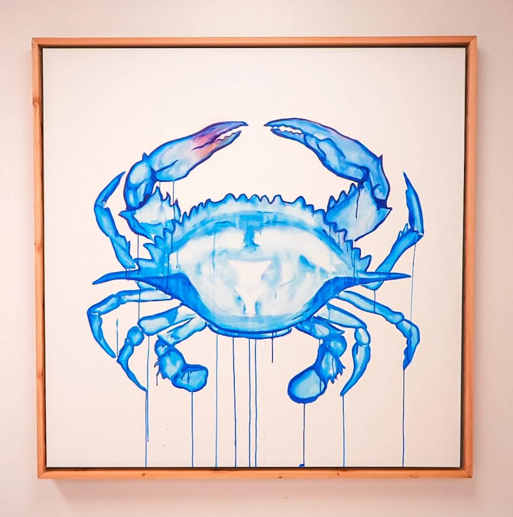
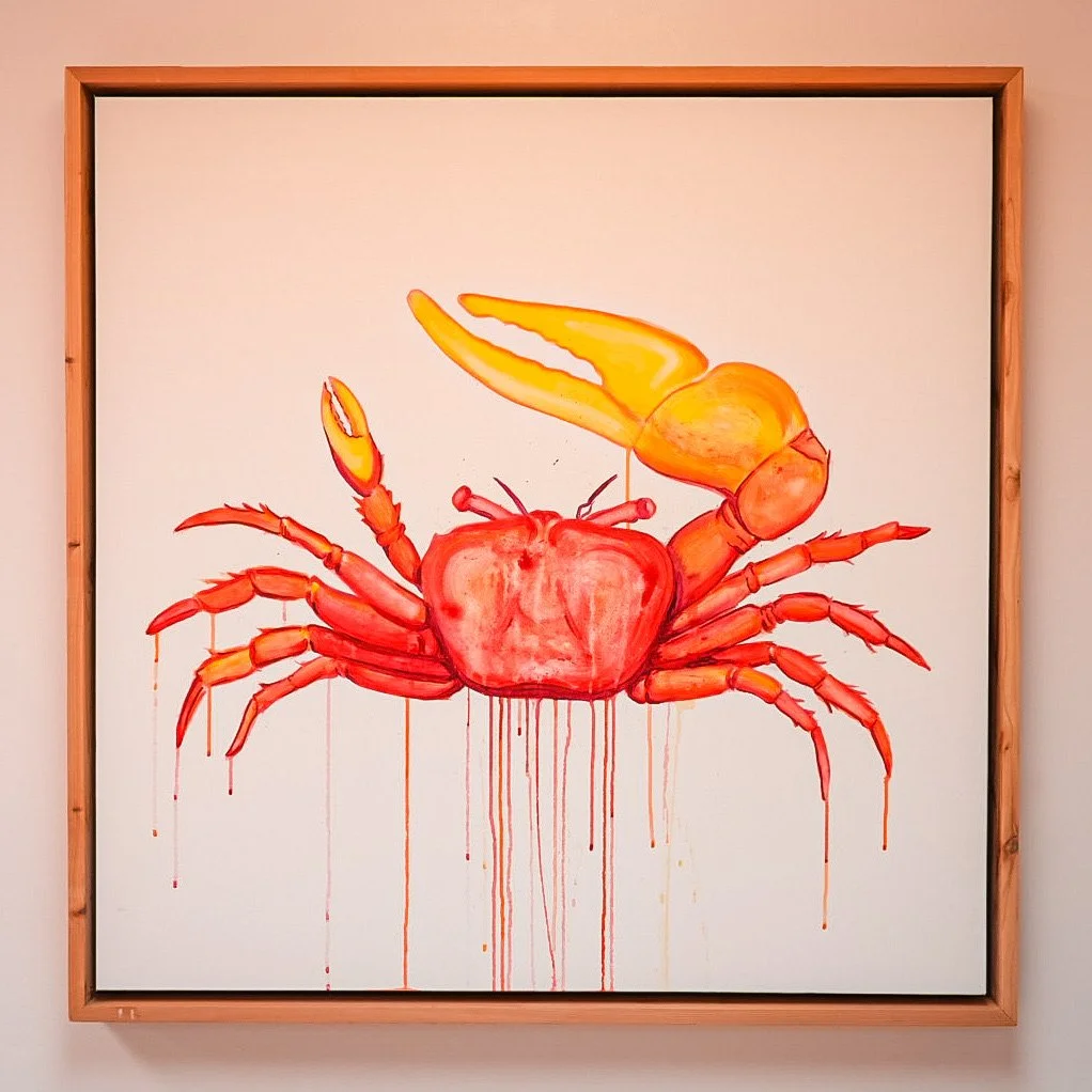
Pop Icon-ography: Stand out
“The public has a right to art
The public is being ignored by most contemporary artists.
...
Art is for everybody.
...
I am interested in making art to be experienced and explored by as many individuals as possible with as many different individual ideas about the given piece with no final meaning attached. The viewer creates the reality, the meaning, the conception of the piece.” - Keith Haring
This series I am currently working on comes from many sources of inspiration. I was inspired by Haring’s determination to reach the public and expose them to art. That you don’t need to have a degree or read a book to understand a painting. It can be something anyone can see and enjoy. My friend and mentor, Amiri Farris believes the same and has helped me find my drive to create. Art doesn’t have to be perfect to be enjoyed. It needs to be seen.
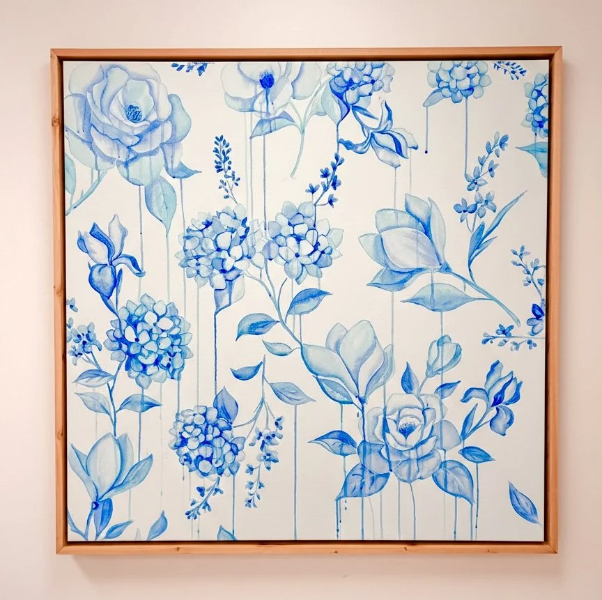
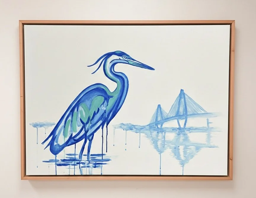
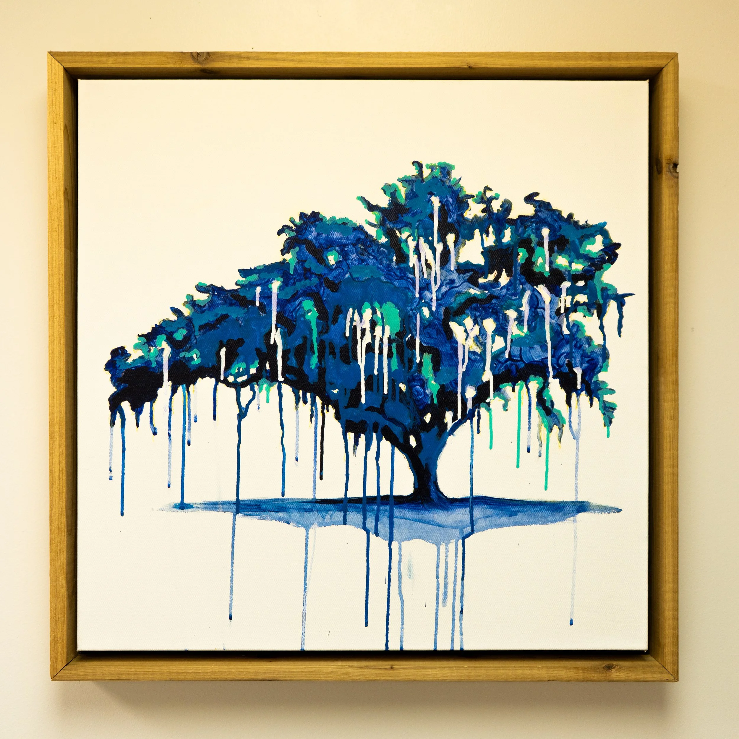
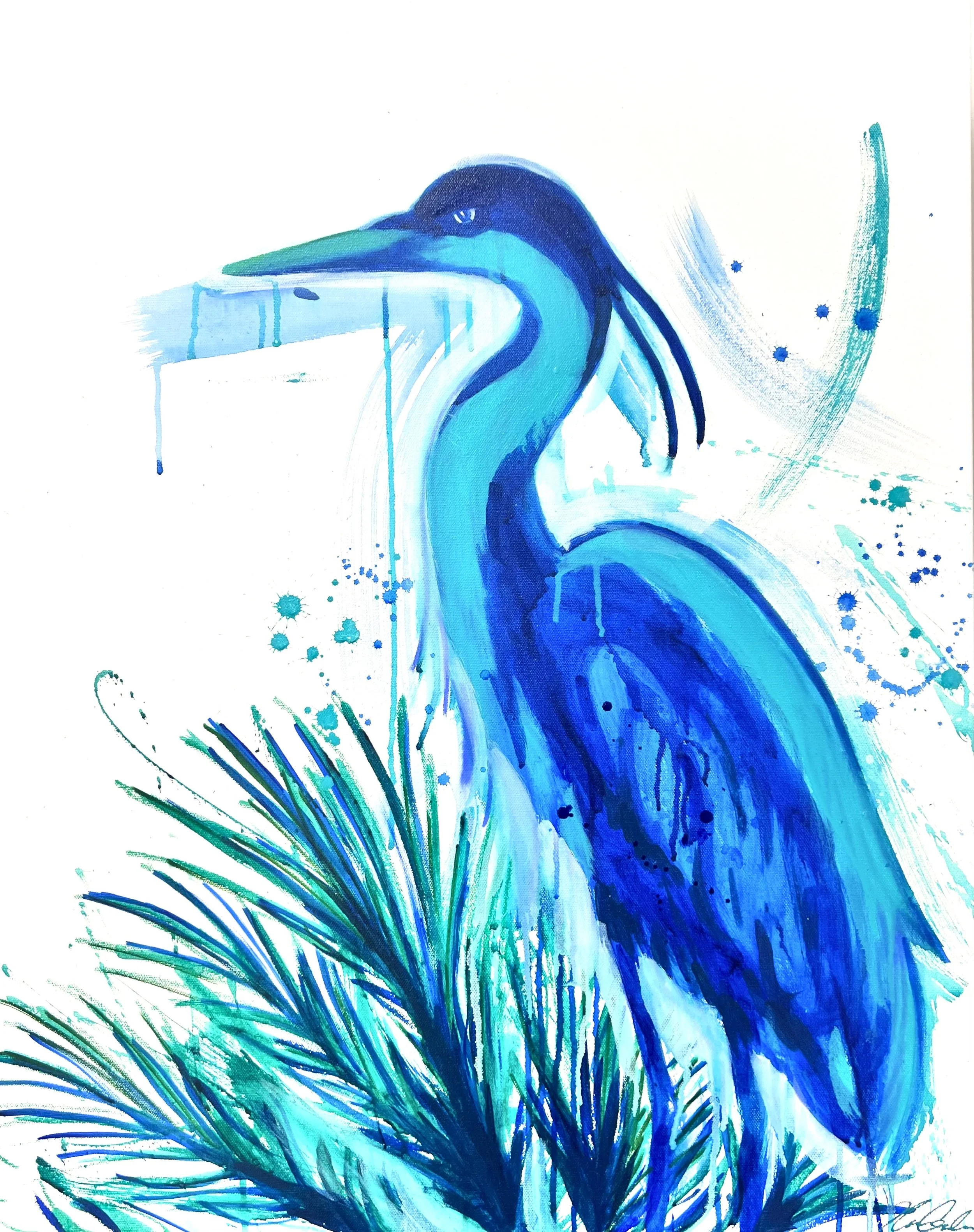
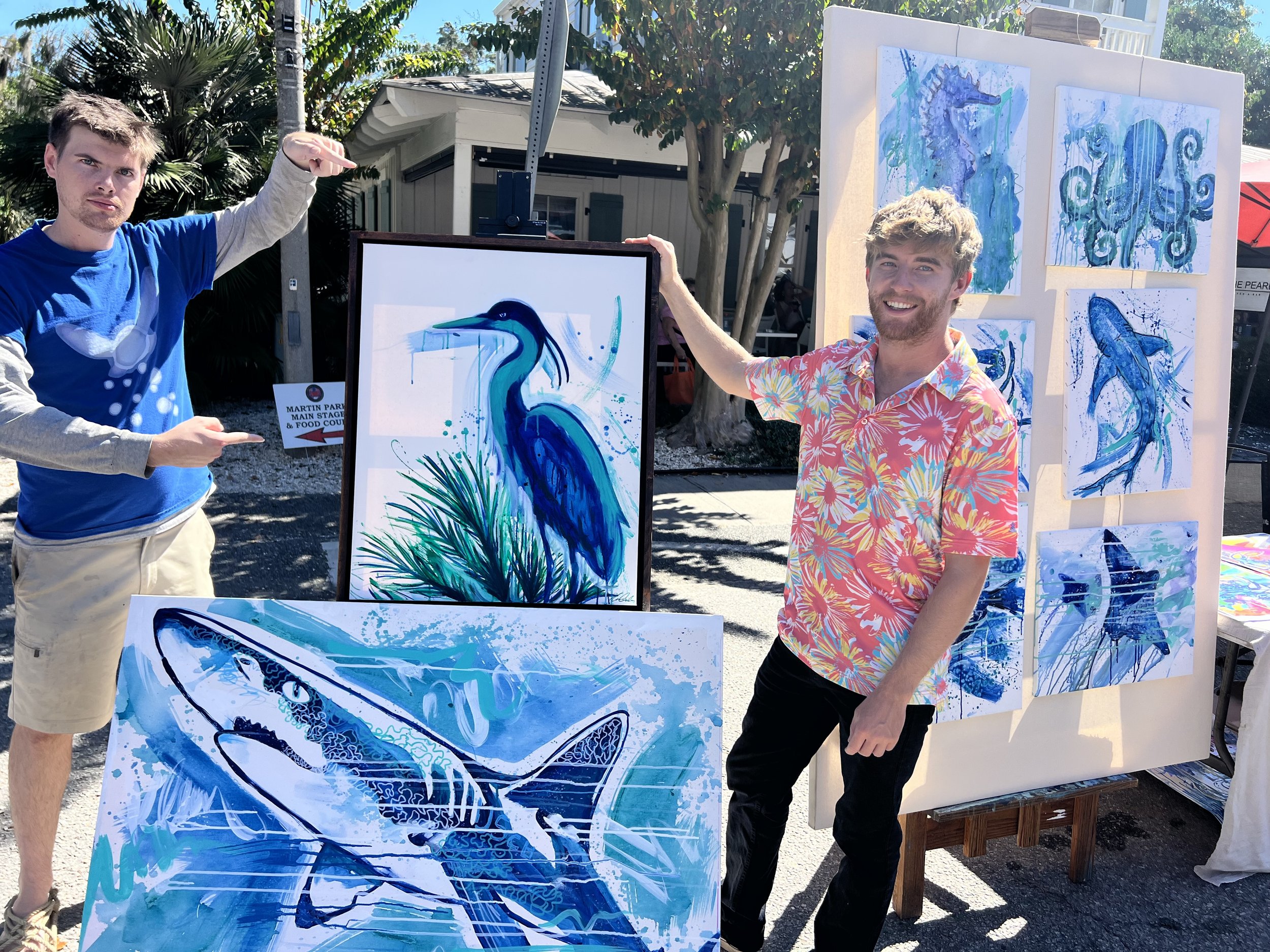
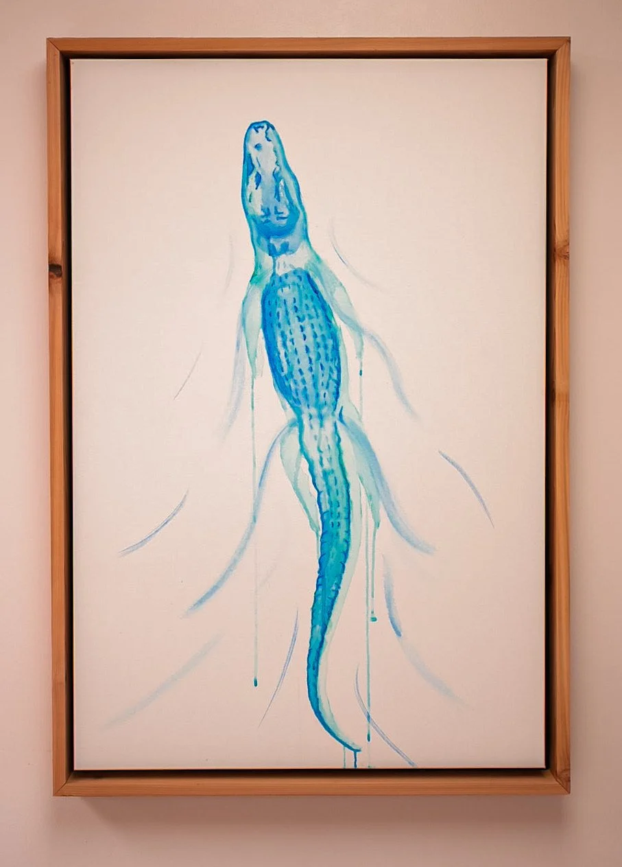
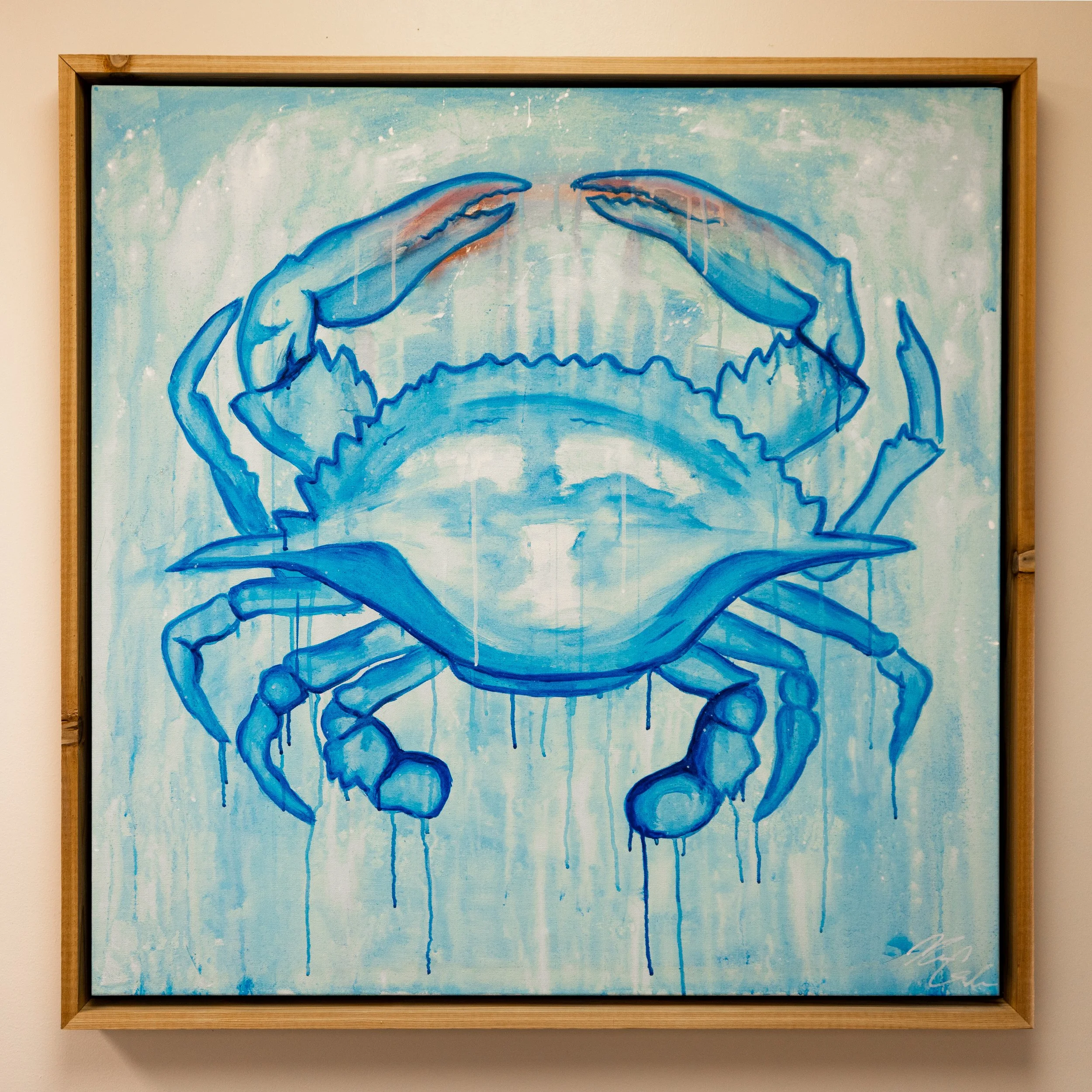

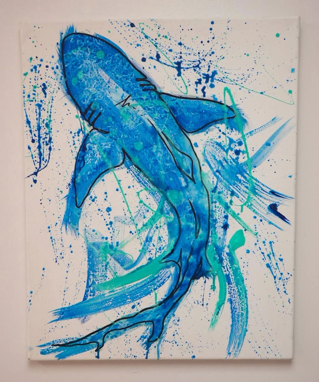
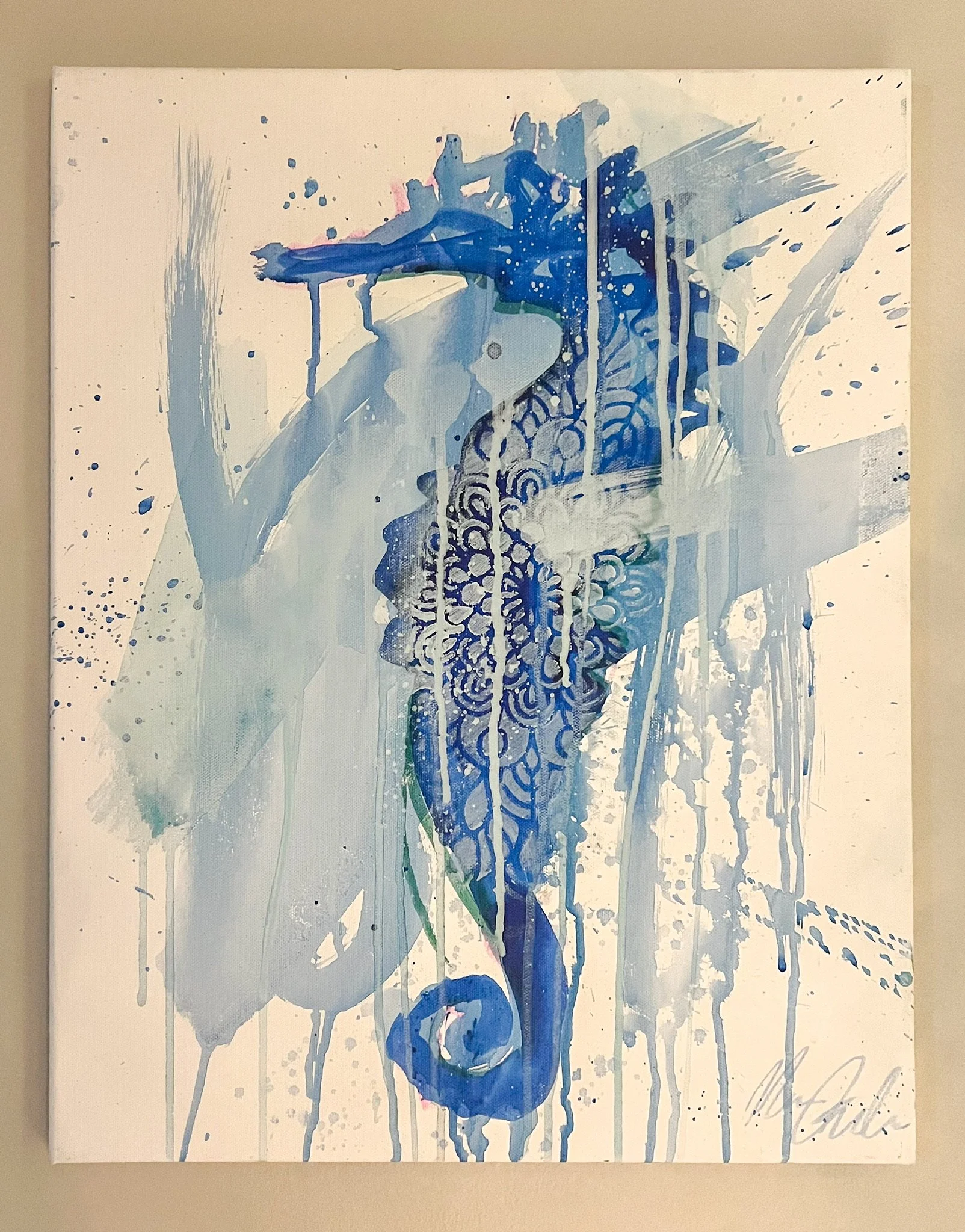
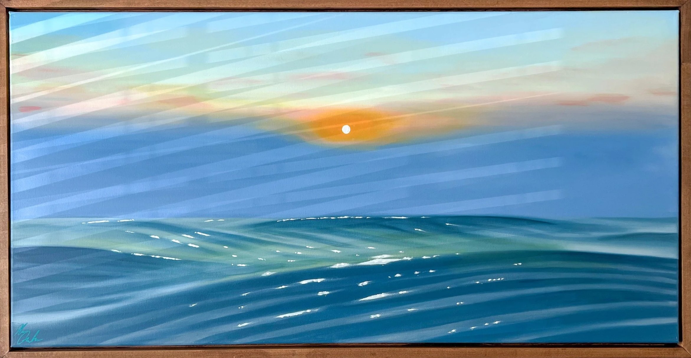
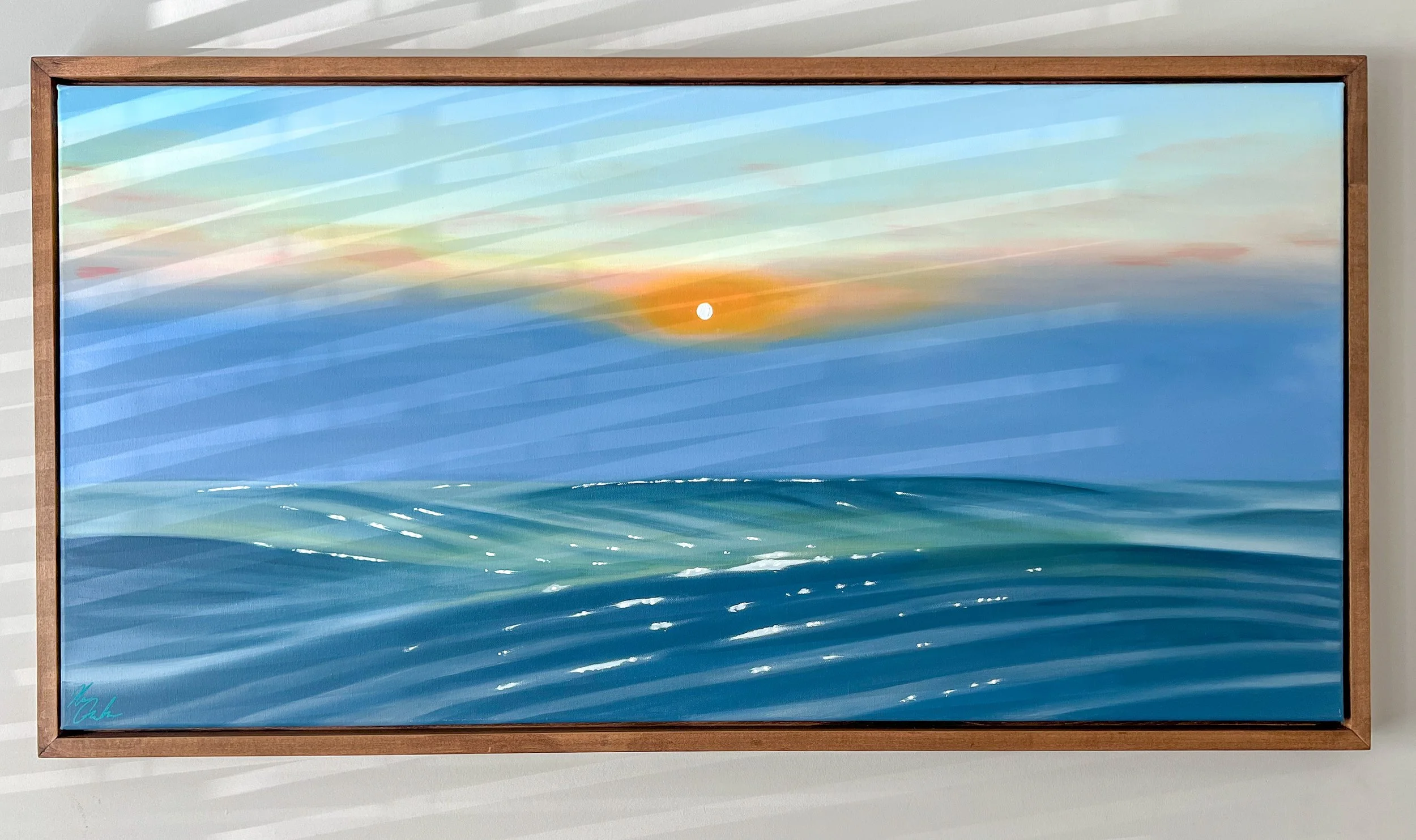
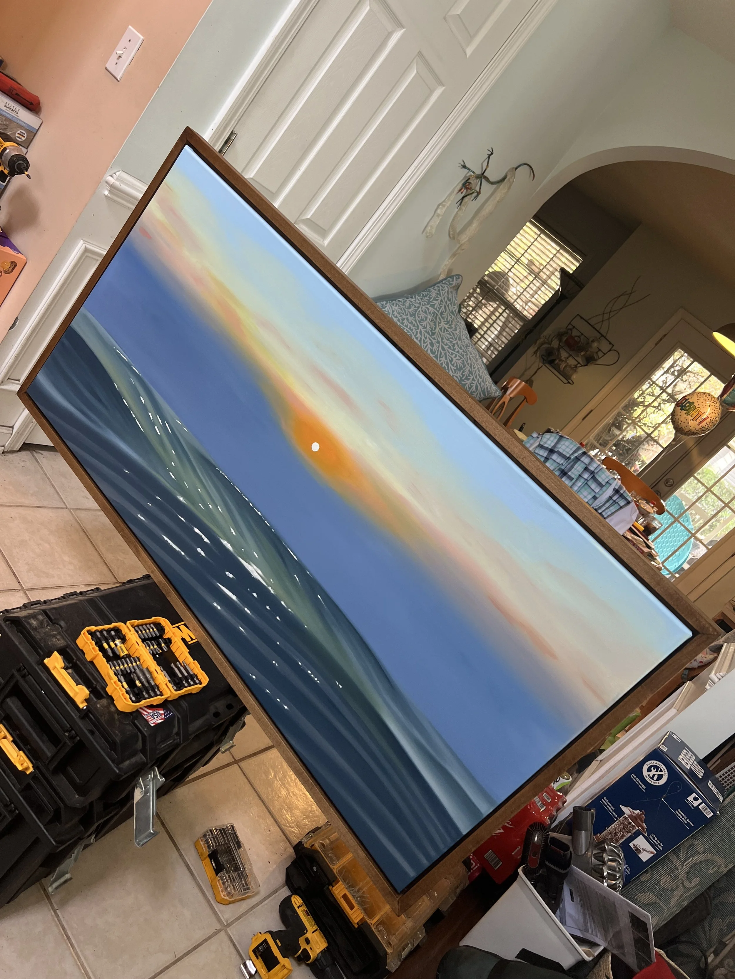
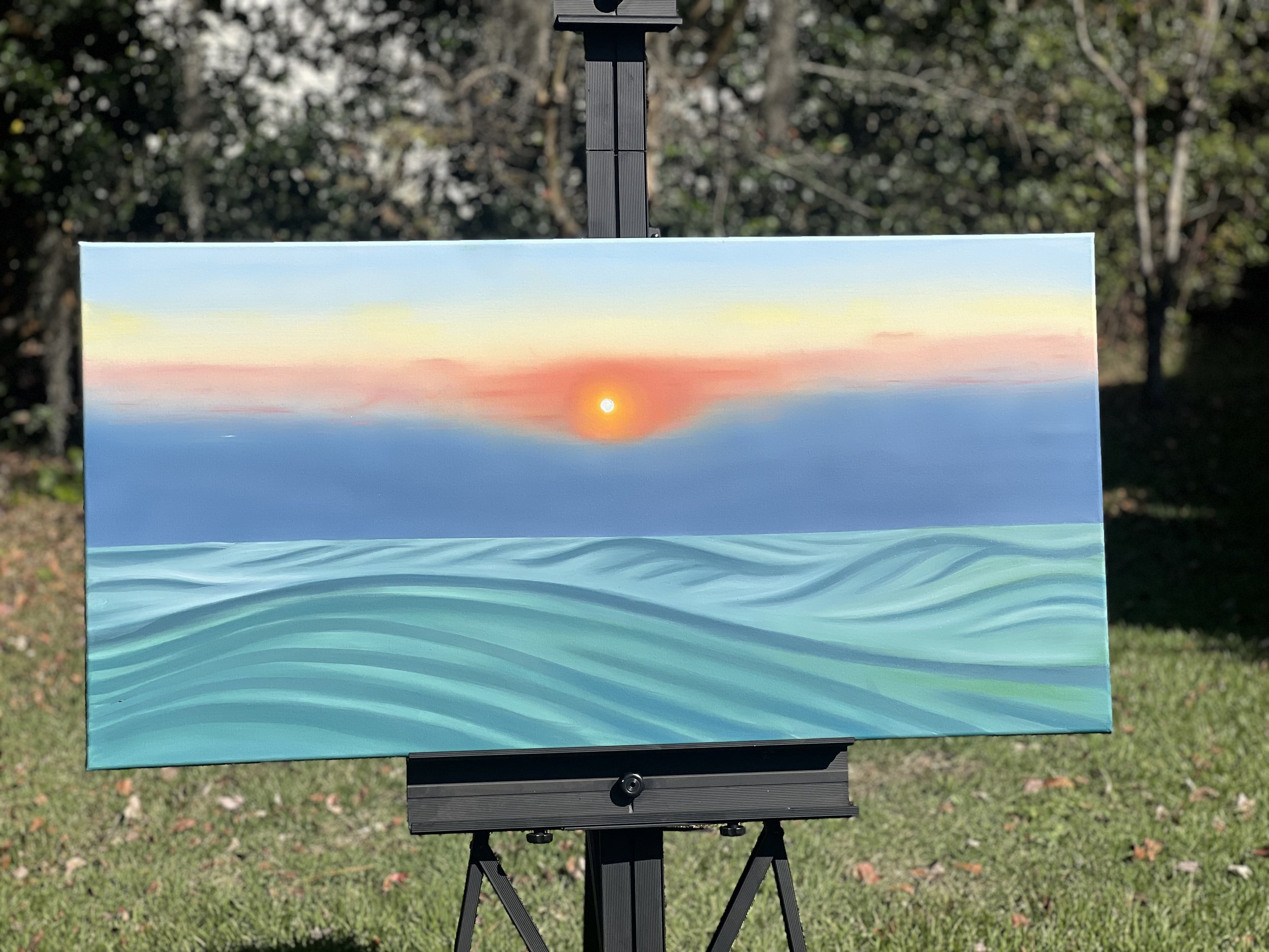
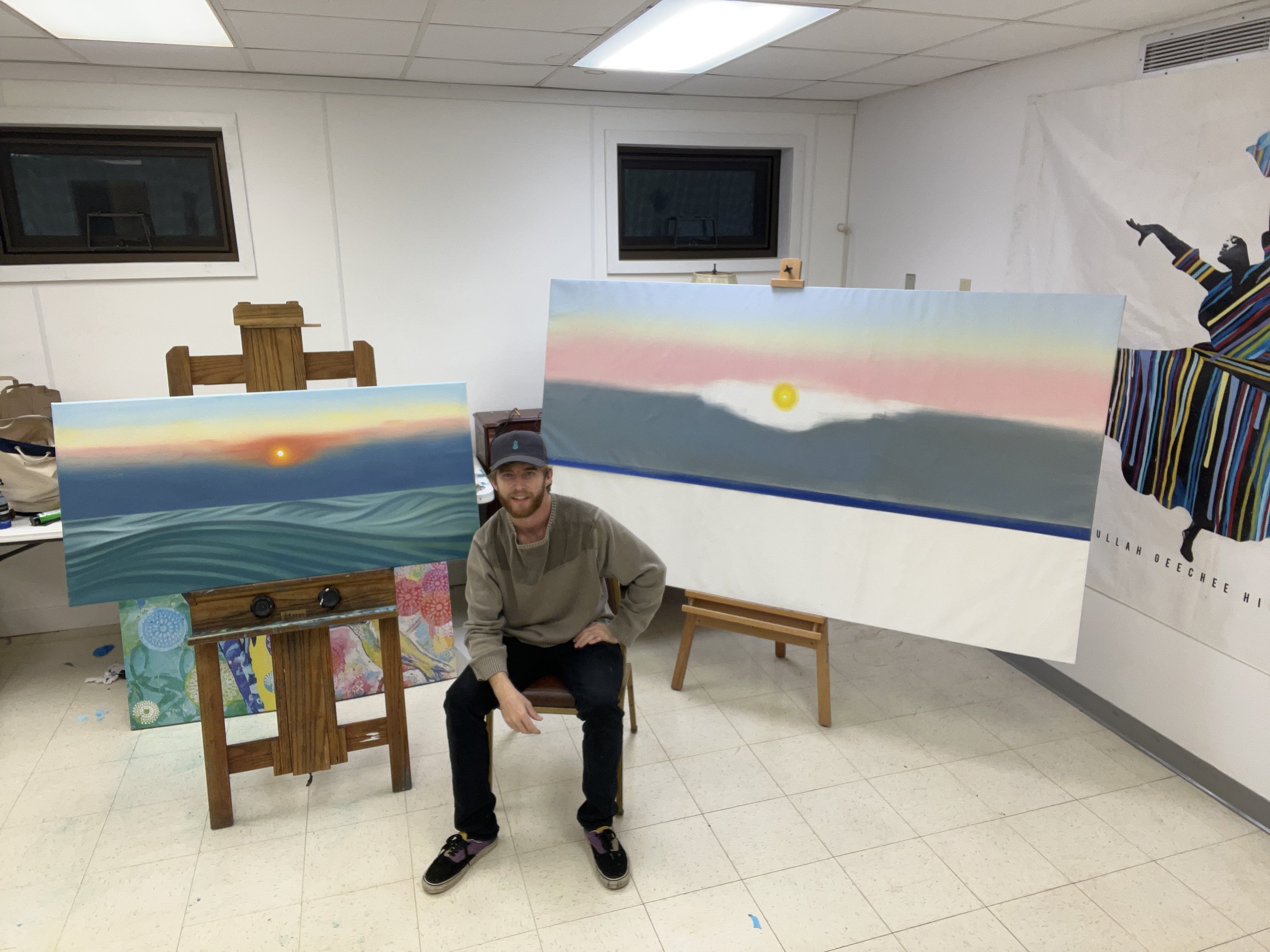
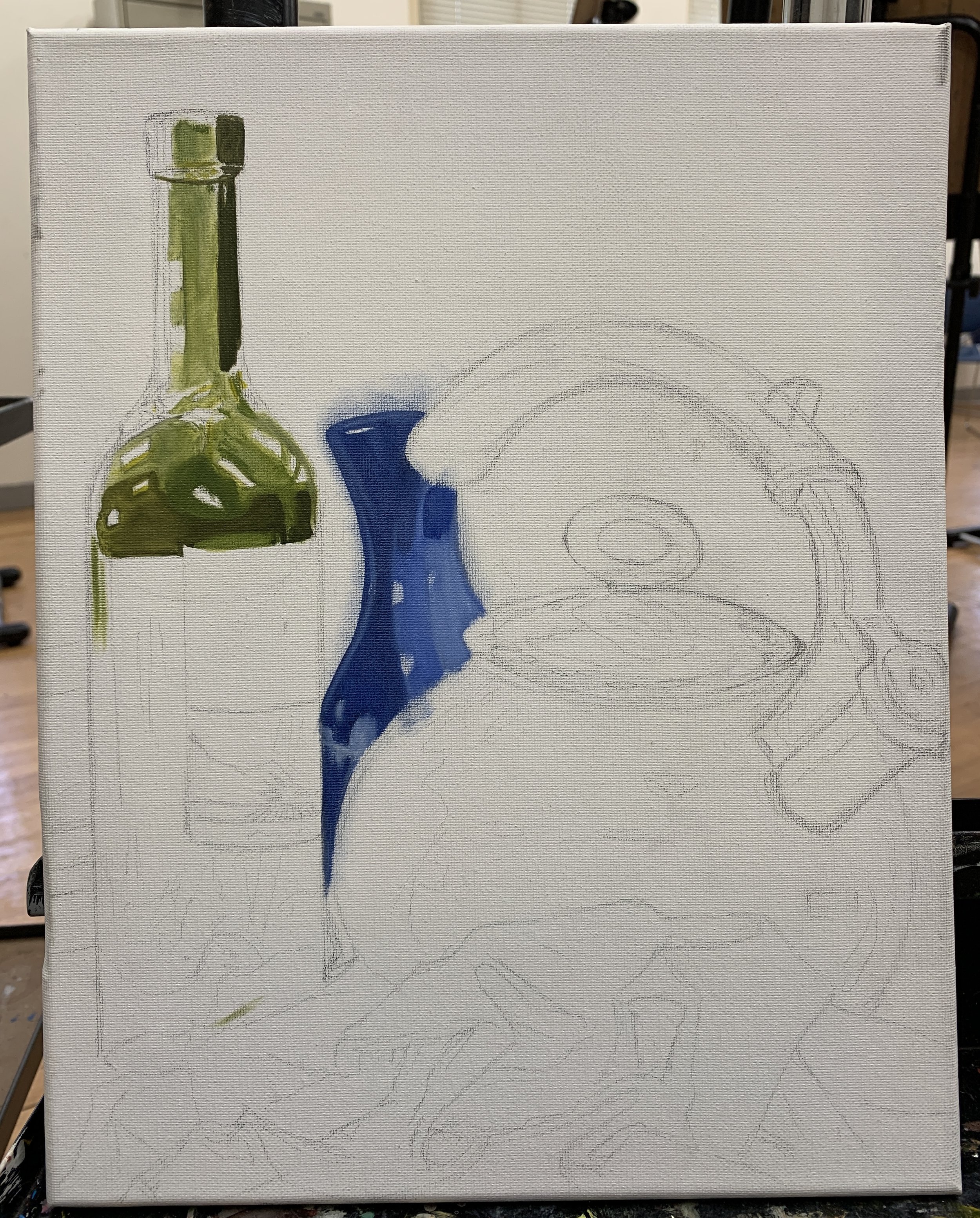
Ocean and sky paintings show the beauty of nature. Having served as an ocean lifeguard has profoundly influenced the inspiration behind these paintings. The constant interaction with the sea’s ever-changing moods, the play of light on the water, and the dynamic movement of ocean waves have all become central themes in this work. This unique perspective allows me to capture not only the visual beauty, but also the depth and raw power of the ocean, bringing an authentic and vibrant energy to each piece. I want to capture this theme with skill, adding calm and inspiration to any space.
Eternal Tides
Lessons from Past Masters
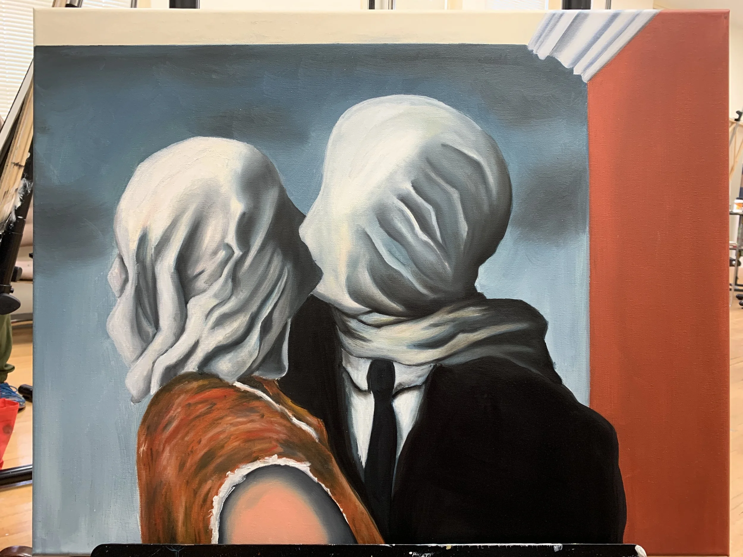
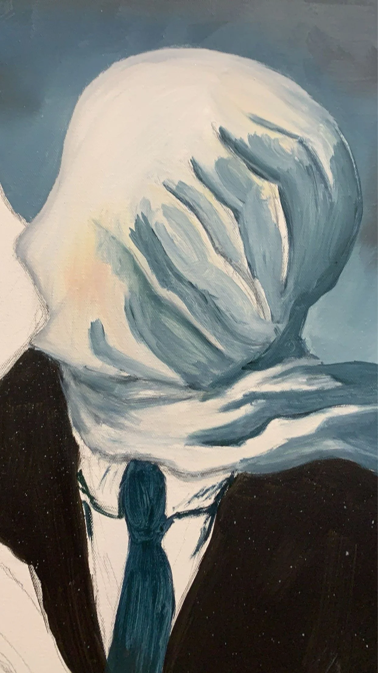
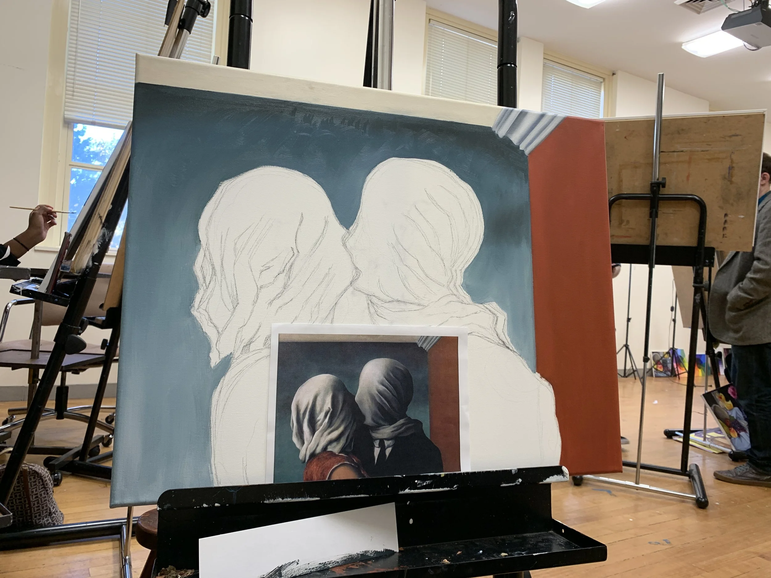
René Magritte, a famous surrealist artist, blurs the line between real and imagined. His painting The Lovers shows two people kissing with their faces covered, symbolizing mystery, closeness, and barriers between people. Magritte’s art reminds us that there’s more beneath the surface.
Copying old master paintings is one of the best ways to learn art. When you copy a well-loved painting, you’re practicing more than just brush strokes—you’re understanding the artist’s choices. Why did they add that shadow? How did they mix colors to create a mood? It’s like talking with history.
Studying light and dark (value) is key. Value shapes everything you see. Without it, colors look flat. When you focus on value, you can learn what makes the painting feel real and alive. Mixing colors then becomes about knowing how light and shadow change hues, how warm or cool colors affect feelings, and how contrasts draw your eye.
This way of working trains your eye better than anything else. Instead of guessing or following tutorials, you see how the art works. This helps you gain confidence because you’ve learned the rules by stepping into them first.

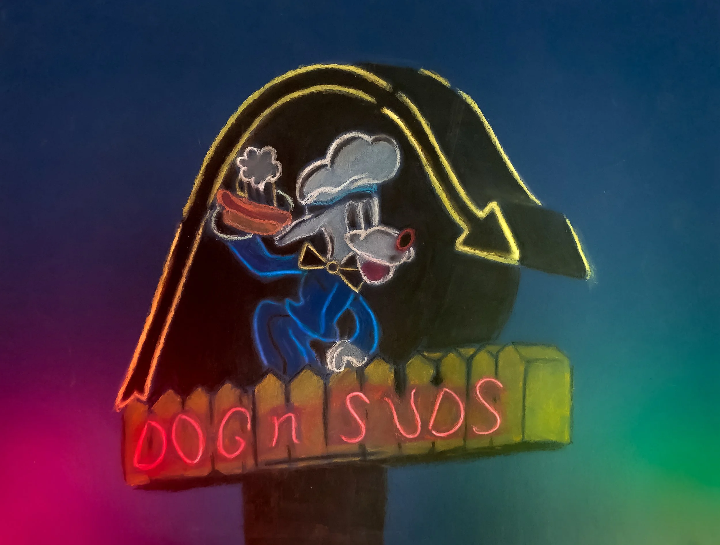
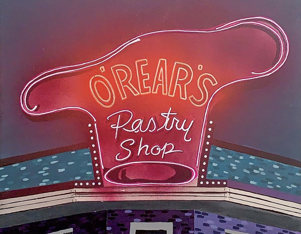
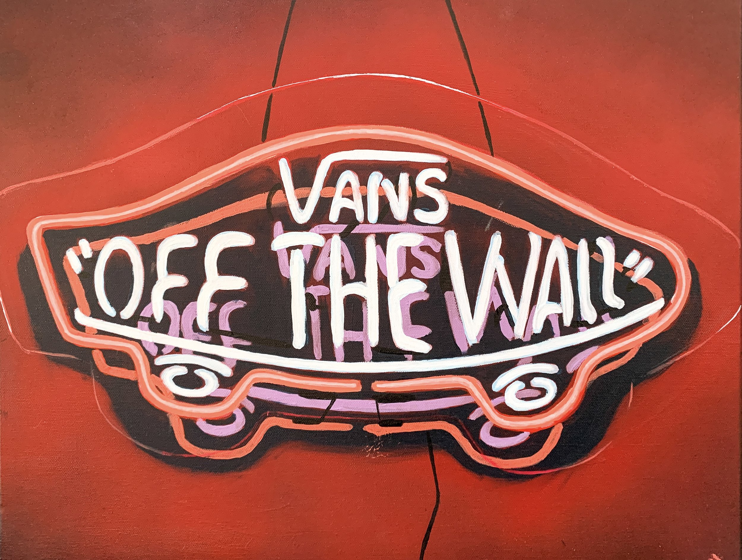
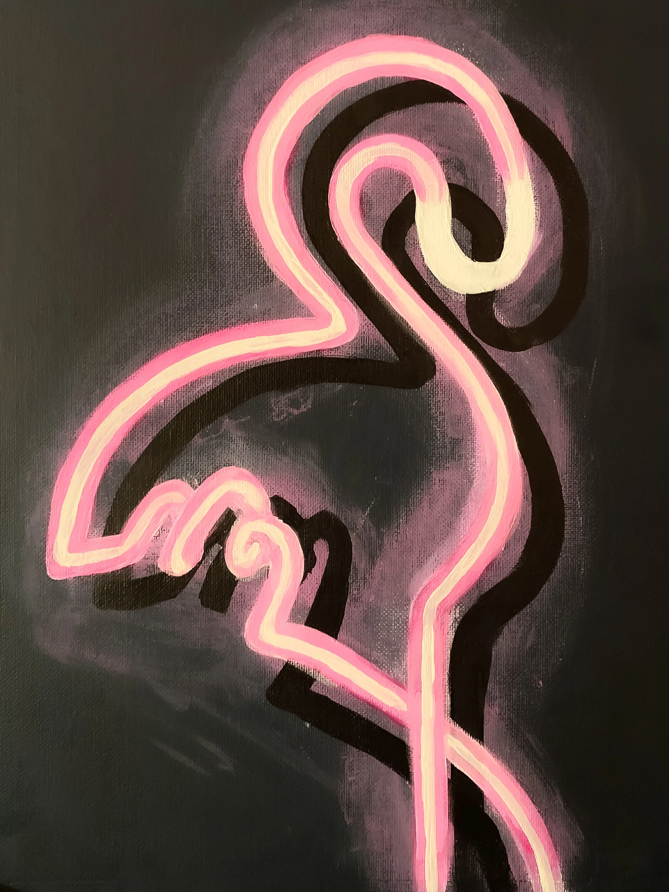
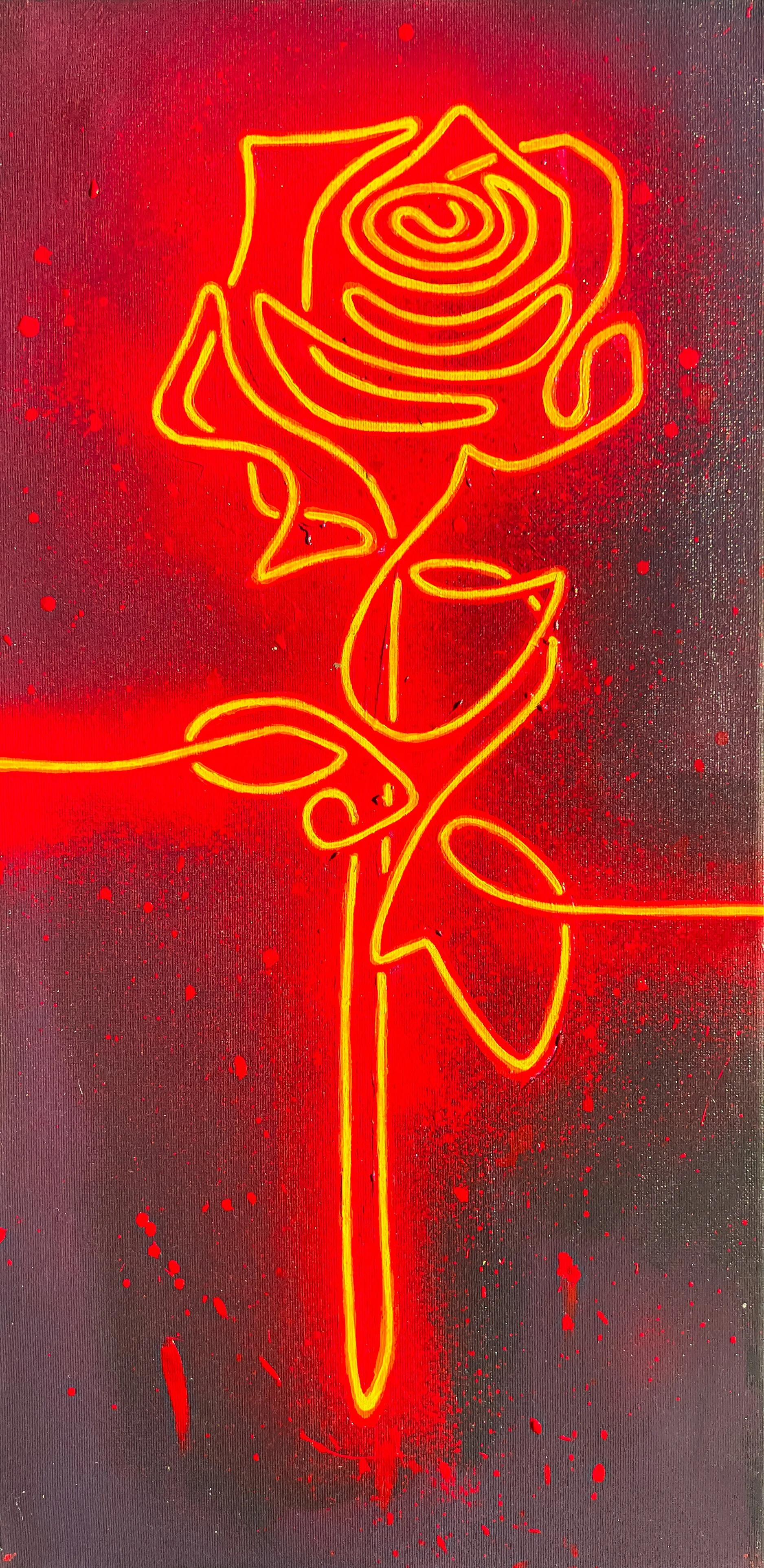
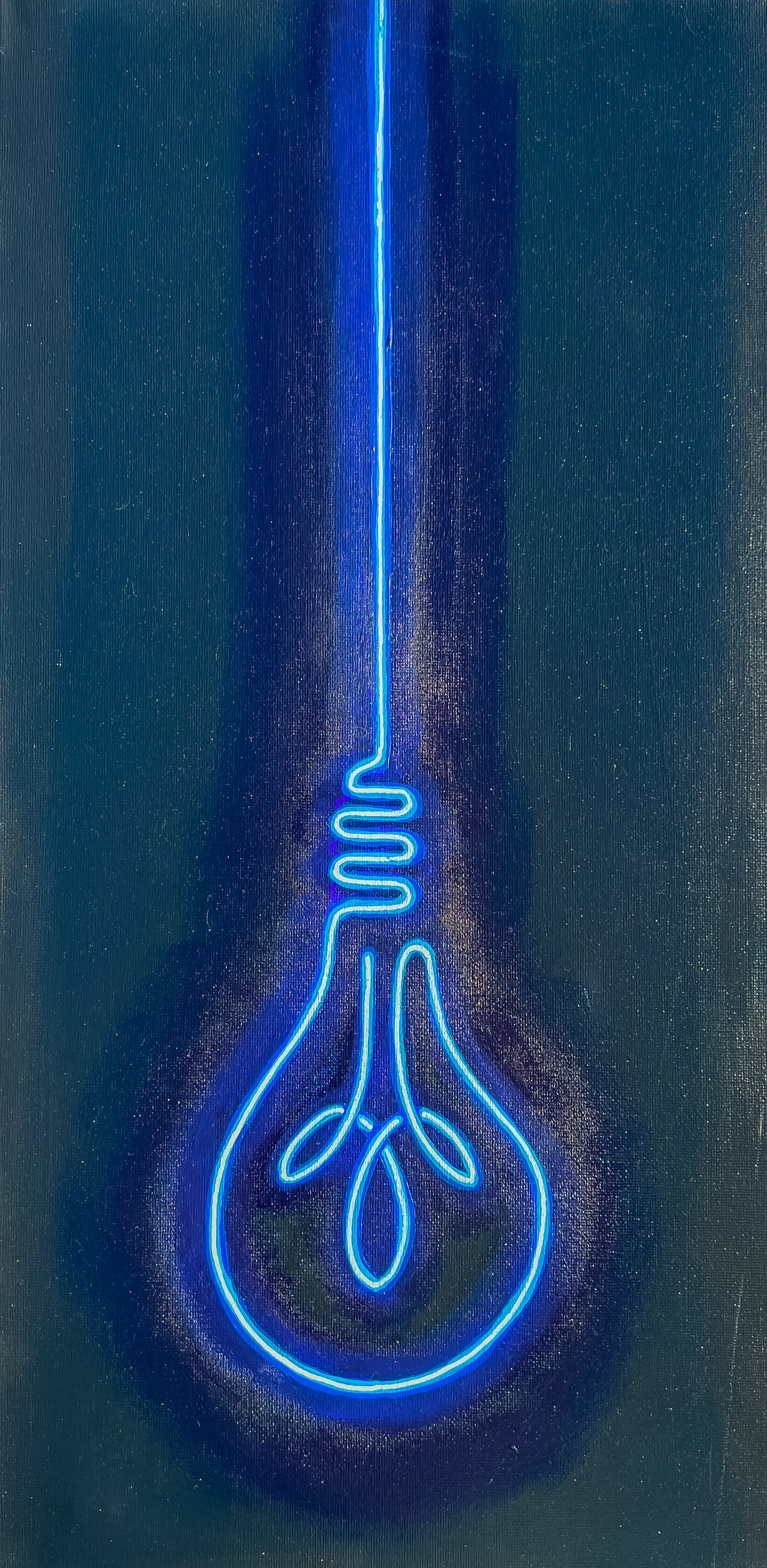
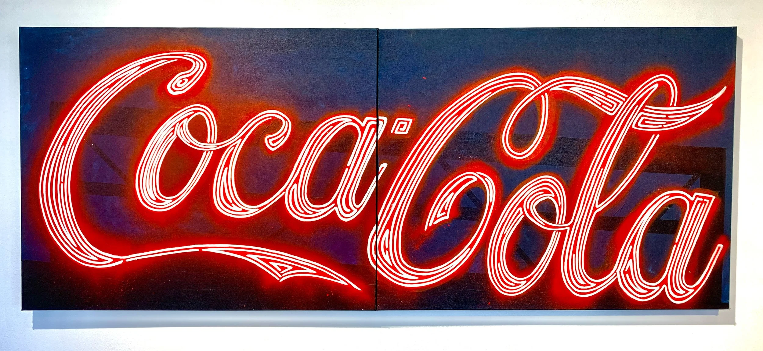
LUMINOUS VISIONS: THE ART OF NEON PAINTINGS
Neon signs were developed by French engineer Georges Claude in 1902, and patented by 1910. The first sign that went into production was for Packard motors and was on display by the early 1920’s. Neon soon took in the coming years becoming a bright sign and image of progress and the future. By the 1960’s neon started to decline as more efficient lights were becoming more accessible. By the 1980’s there were only six neon specialist left. My interest and fascination drew me towards these signs and the history that these unique stores carry. In more recent years, neon has begun making a resurgence with it the lights becoming art forms in their own rights.